Subscriber Benefit
As a subscriber you can listen to articles at work, in the car, or while you work out. Subscribe Now
 If you’re like me, you have a hard time remembering what you had for dinner last night. On the other hand, I can usually tell you the last really great meal I had. And if you ask me, a really great meal has almost as much to do with the atmosphere as the food.
I think it’s the complete experience—the company, the fare, the libations and the ambiance—that make the meal memorable.
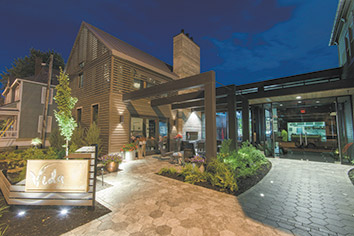
Speaking of ambiance, there is a newly enlivened place that has recently caught my attention, not because it’s big or designed by a big name, but because it’s a great example of solid design. It is a new restaurant called Vida at the corner of New York Street and Park Avenue in the Lockerbie area, designed by Phanomen Design.
It is deceptively difficult to fashion a design that is authentic to a local milieu, particularly a historic one, and avoid stylistic mimicry. If you were in Paris, you wouldn’t want “French cuisine,” just great food from France.
Vida pulls it off. It’s anchored by a renovated Italianate structure, but it’s the marriage of new and old that is both forward-looking and genuine. By itself, the scale and proportion of the addition are simpatico with the neighborhood. The addition’s real triumph, though, is its simplicity, which is simultaneously deferent and provocative. The original building and the addition feel as though they were always meant to be together. Their massing creates a comforting hierarchy and defines spaces inside and out.
If you have ever cooked anything, you know that success hinges on selecting the right ingredients and then paying careful attention to their preparation and combination—simple sounding but immensely difficult to achieve. It is the attention to detail and material choice that make Vida a standout. The use of reclaimed wood could have been cliche, but here its use on the secondary massing is handsome, sophisticated and reinforces the utilitarian aspects of accessory buildings common in the neighborhood. The rhythm of board siding on the primary addition integrates it with the historic building while adding a restrained contemporary flair.
The master stroke, a risk perhaps, is the deep gray colors applied across the entire exterior. Fashionable, yes, but somehow they seem to accentuate the detailing in the original structure and afford Vida a presence that is commanding but not dominating.
Simply following a recipe never quite captures the same touch of a creative chef who adds a bit of the unexpected. Stepping into Vida’s interior is like a bite of a creme egg—having broken through the understated shell, the richness and articulation of the materials are soothing and luxurious. The evening reveals another unexpected treat, further celebrating the pleasant interior glow, as it seeps through the staccato slits in the rain-screen facade of the addition.
My one criticism is for the exterior public space, which feels a bit like the chefs paired the splendid entree with a salad of iceberg lettuce. While the clay brick sidewalk is a warm and pleasant nod to Lockerbie, the patio surface material and pattern feel jarringly out of place and represent a missed opportunity to bring the thoughtful interior detailing to the outdoor space. The landscape seems uninspired by the provocative aspects of the architecture, sustainability or the cottage garden tradition of the neighborhood. Fortunately, comfortable seats by a fireplace always can gather a crowd.
Perhaps what makes Vida worthy of remark is the fact that such follow-through by everyone involved is too rare. It shows what is possible when designer and owner fully realize a shared vision that is in tune with local values and contemporary culture.
Check it out for yourself and, if you stay for a meal, enjoy the atmosphere. Let me know how the food is.•
__________
Gallagher is an urban designer with Ratio.
Please enable JavaScript to view this content.

